
Commcorde
A brand & AI presentation design system for a London strategic communications, PR and reputation-management firm — working at the intersection of intelligence, privileged media relationships and cross-border capability. One token system that generates executive, insight-driven decks that read as if prepared for a board, an investor, or a head of state.

Executive by
default.
“We transform how organizations navigate the global information landscape.”
Commcorde serves executives, governments, listed companies and public figures who need to navigate the global information landscape — protecting against threats while creating strategic advantages. The brand had to encode that authority into a repeatable system, not a one-off deck.
So the identity is delivered as design tokens — colour, type, spacing, layout rules, a component library and a slide-template library — that generate premium, data-first presentations at Bloomberg / McKinsey grade.
Commcorde is
Commcorde is not
Tone of Voice
Authoritative, precise, strategic — a trusted advisor with privileged access; confident but never boastful, calm under high stakes. It favours the language of intelligence: narrative control, reputation defense, strategic upside.
Headlines lead with the idea in eight words or fewer. Numbers are the hero, each paired with a plain-language line. Title Case for titles, UPPERCASE tracked for eyebrows, sentence case for body. No emoji, no hype — restrained and premium.
Colour System
A deep-blue spine, cool blue-grey neutrals, an executive-dark theme and a disciplined strategic-status palette used only to signal state.
BRAND BLUES — THE SPINE
EXECUTIVE-DARK SURFACES
NEUTRALS & INK
STRATEGIC STATUS — USED SPARINGLY
Type System
Plus Jakarta Sans is the single brand family — UI, headings, body and large section numerals. There is no secondary typeface.
Headings are Bold / Extrabold with tight tracking (−0.02em); body is Regular / Medium; large numerals are Extrabold.
Casing Rules
Overline Device
Spacing, Grid & Rhythm
8px Spacing Scale
Base unit 8px · 12-column grid.
Slide Layout
Radii · Shadow · Motion
The Mark
A confident wordmark with a modular network mark — blue on light, reversed white on dark and photographic grounds.
Placement
Lockups
Slide Library
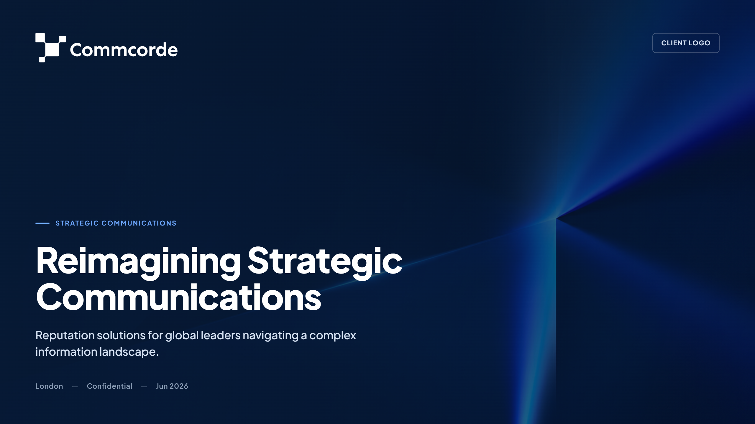
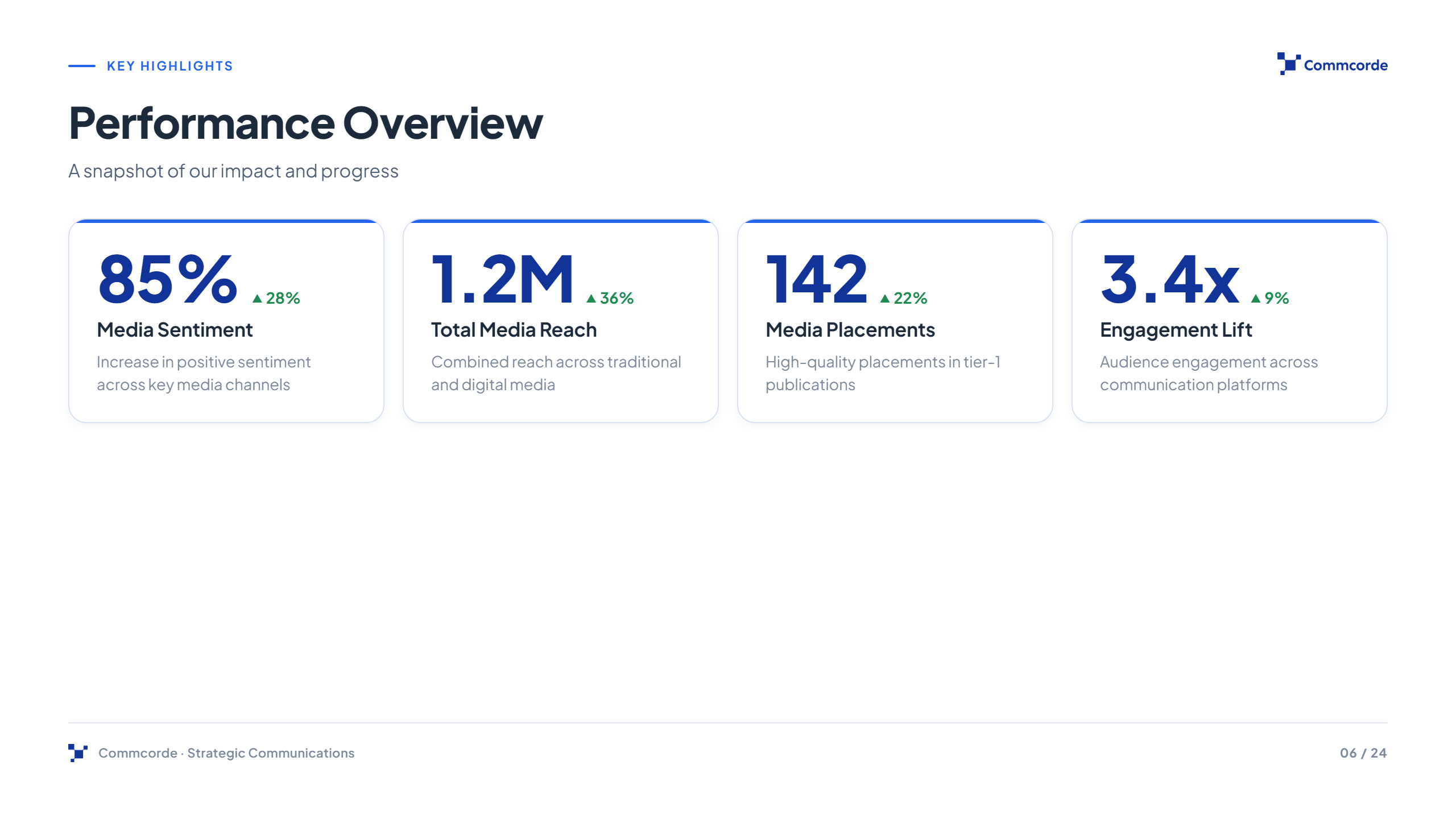
A template library that turns the tokens into board-ready decks - every layout on-brand by construction.
Quarterly Standing
| Workstream | Status | Trend |
|---|---|---|
| Narrative control | On track | ▲ 12% |
| Media relationships | Strong | ▲ 8% |
| Threat monitoring | Elevated | ▼ 4% |

Live Website
Beyond the presentation system, I designed and built Commcorde’s public website — extending the same tokens into a responsive digital presence: executive-dark grounds, the brand-blue accent, Plus Jakarta Sans and the strategic, evidence-led voice.
Navigate the global information landscape with intelligence.
Strategic advisory for organizations, public institutions, founders and public personalities - protecting reputation and creating strategic advantage in contested environments.
Iconography
Minimal, geometric, outline icons only — Lucide at 1.5–2px stroke in brand blue. No cartoon, no 3D, no emoji, ever.
Art Direction
Cool, premium, real
London skylines at dusk / gold hour, glass architecture, energy infrastructure and abstract blue “intelligence” light fields — always cool temperature, never warm consumer stock.
Treatment
Photographic grounds appear on covers & dividers behind a navy protection gradient (linear, ~96% → 40% opacity) so white type stays legible. No busy patterns; a subtle blue circuit texture is reserved for tech / AI contexts only.
A recurring shield / pentagon clip frames imagery on solution slides — reputation as protection.
One token system that makes every deck executive-grade by default.
Colour, type, spacing, components and a 9-slide template library, all traced to a single source of truth — so a global advisory generates premium, insight-driven presentations without a designer in the loop.